When designing the logo XXXI Days of Announcing the Holidays!, my team and I aimed to create something that felt instantly sporty. The challenge?
It also needed to look 3D, evoke the winter holidays, and hold a humorously long title — a signature Comedy Central touch.
As I began researching, my mind immediately went
to the bold aesthetics of Super Bowl and weeknight football logos: oversized Roman numerals, sturdy geometric typography, and the iconic shield framing it all. That became the foundation for my design process.
I began my logo exploration with the shield, experimenting with hard angles versus curves and tilted perspectives versus straight-on views. This shape would set the tone for the entire design and was key to capturing that sporty aesthetic.
Next, I focused on the Roman numerals, carefully adjusting their scale in relation to the surrounding typography. They needed to feel bold and dominant without overshadowing the rest of the message.
From there, I explored ways to weave in holiday elements that added a wintery feel without compromising the athletic tone. Christmas lights, candy canes, pine trees, and ribbons became tertiary
details — subtle touches that helped tie the festive and sporty concepts together.
At this stage, the design was starting to come together, but it still wasn’t quite there. I liked the shield shape and the holiday lights framing it, but I wanted to push the Roman numerals further and explore more dynamic treatments.
I also hadn’t yet landed on the right script font — it needed to be clear and legible, while complementing the overall design and preserving that festive, holiday vibe.
Now for the fun part — bringing the logo to life with sleek metallic textures and vibrant color. While classic holiday tones like green, red, and yellow were a must,
I had to carefully adjust their values to preserve a masculine, sporty feel.
It was also important to strike the right balance between colors, ensuring none of them overpowered the rest. At this stage, the design was finally coming together — and I was getting very close to the final look.
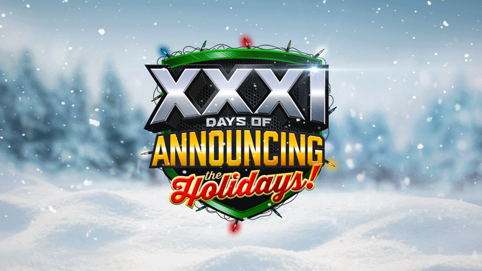
After some discussion between my team and the producers, we finally arrived at the finished design.
The green shield framed by lights, reminiscent of winter balsams, set the festive tone. The metallic Roman numerals evoked the legacy of classic Super Bowls.
The red script font added a touch of holiday sentimentality, while the strong geometric lettering, colored in Summer Ale, Comedy Central’s signature swatch, tied everything together.
The logo felt undeniably sporty, conveyed the right energy, and made the lengthy title easy to read. Overall, we considered it a success.
With the primary logo finalized, the next challenge was adapting the layout to a horizontal composition. Because this logo was designed for television, there would inevitably be times when it needed to appear alongside tune-in messagingin the lower third of the screen.
While fitting a complex design into this space can sometimes be tricky, I was confident this solution would translate well. The shield still served as a strong container for the Roman numerals, while the remaining typography held its own alongside it. In the end, I felt this horizontal version was just as successful as the original.
With both the primary and secondary logo designs finalized, the next step was deciding how to present the logo on the endpages of our various spots. One of my teammates suggested a beautiful winter wonderland background that complemented the logo perfectly. The subtle whites and blues of the snow-covered landscape allowed the colorful logo to take center stage and reinforced the wintry theme.
It was a fantastic pairing that brought everything together seamlessly.
Now came the best part: bringing the logo to life with motion graphics! Flashing Christmas lights, dynamic lens flares, and swirling snowfall all came together to create an eye-catching, animated finish.
This project was such a blast to work on, and I’m so grateful to have had an amazing team by my side every step of the way!
Logo References

Logo Options
Logo Refinement
Logo Color Treatment
Final Logo
Horizontal Logo Lockup
Logo with Background

Animated Logo